I.C. Angles Investment Post…
This bull market increasingly looks scary. Setting new record highs and extending deep into 2013 only makes it look more worrisome. It was only a little more than a year ago I recommended investors keep stocks as the largest portion of any long-term investment portfolio. But that advice came with the caveat that market risk would rise in 2013, and indeed I have become increasingly nervous about stocks this year. Although I have yet to declare a market top, and will not call a bear market until important technical levels are broken, I have not hesitated urging taking profits and raising cash levels by selling stocks as this market has set new record highs this year. Pictures can often convey more than words, and in this post I am going to highlight a few notable and scary charts related to the current stock market.
A Long Drop Ahead
In my last post I argued that this stock market remains in a secular bear market. If that is true then we may have a long drop ahead. The below chart shows the long-term trend of the stock market, since 1871, through secular bull and bear markets. Secular bear markets typically go below trend, which would necessitate a significant and sustained drop from the market’s current heights. Despite some recent John Hancock commercials you may have seen on television telling investors now is the time to think about getting back into the stock market and surveys showing the wealthy getting more aggressive about stock allocations, according to the below chart this might be one of the worst times ever to invest if we return to the secular bear norm and spend time below trend.
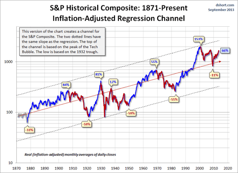
Source: Seeking Alpha “Secular Bull and Bear Markets”
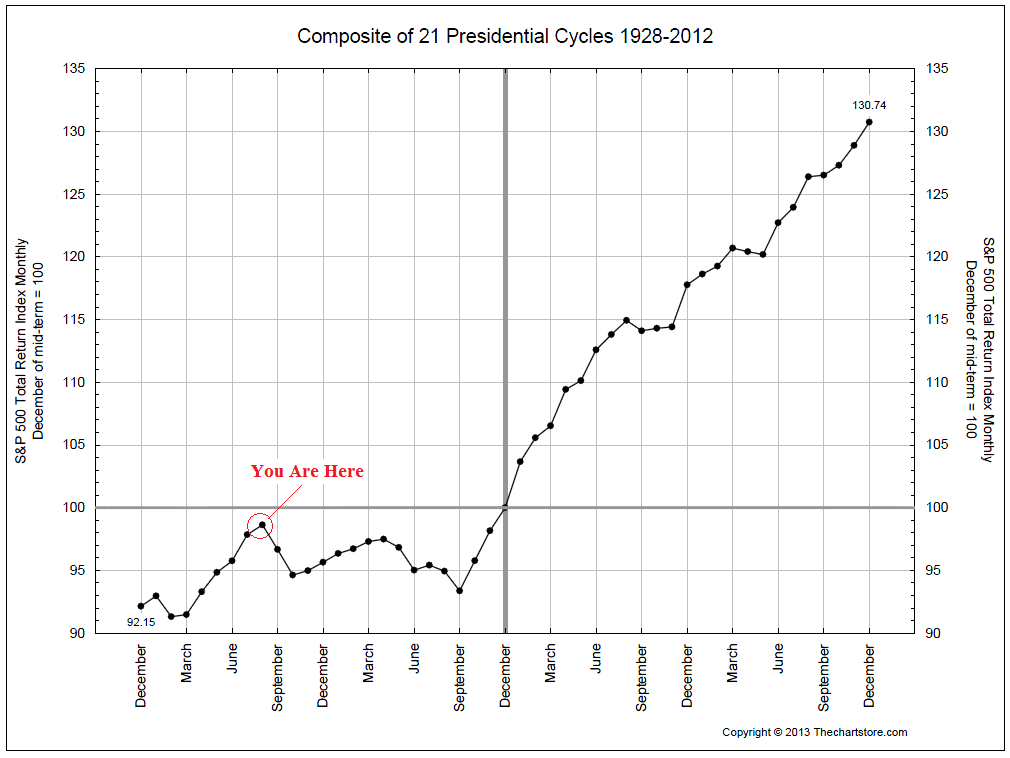
Market Expiration Date
The historical case on a secular basis is scary. Unfortunately, the cyclical case for where the stock market will go over the next few years, based on history, isn’t optimistic either. Earlier in the current stock market rally, I was more bullish precisely, because it was earlier in the stock market rally. Bull markets tend to last an average of 3.8 years. But this bull market is now over four years old. The below chart compiled in January of this year shows the average duration of a bull market, and the current one is now getting old in the tooth.
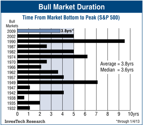
Source: InvesTech Research
Record Profits a Reason to Worry
Maybe this bull market will last quite a bit longer than the average bull market. That is certainly a possibility. Although it’s not one I would bet on. However, when it comes to the stock market now being in a secular bull market and able to sustain itself above its long-term average return, that is a far more doubtful proposition. The evidence simply does not support the economy being in a new era of prosperity that will support a sustainable move higher in the stock market. The move higher in stocks this year has been primarily based on expanding multiples (in fact multiples have expanded at the highest pace since 1999, which didn’t end well.) But a big driving force over this entire cyclical move has been an expansion in corporate profits. The bad news here is that corporate profits, just like stock market returns, tend to be mean reverting. In the below chart running from 1952, profits are shown to be well above their historical trend. Rather than corporate profits going ever higher to support further rises in stocks, they are increasingly likely to decline significantly and take stock prices down with them.

Wall Street Journal “Lofty Profit Margins Hint at Pain to Come for Stocks”
Another Mean to Revert
It’s not just the historical performance of U.S. stocks and corporate profits that paint a scary picture for the current bull market. Stock markets in developed countries tend to also be mean reverting. The below chart shows U.S. stocks far outpacing foreign stocks. Although such a trend could continue, such performance gaps do not last forever. And a larger relative drop in U.S. stocks would be one way for it to be erased. In 1929 that is exactly what happened, disappointing U.S. investors who had hoped the U.S. economy had decoupled from the rest of the world.

Business Insider “The Next Stock Market Crash”
A Foundation of Sand
There are multiple reasons for investors to be worried the U.S. stock market is not in a new era of prosperity that has driven it into a new secular bull market and will sustain a performance lead over other countries. Of all the weakness in the U.S. economy the scariest is the job’s picture. The current stock market looks to be built on an economic foundation of sand. Not only has this been the weakest jobs recovery in the last half century, with the labor force participation rate recently hitting a 37-year low, but as the accompanying chart shows the unemployment-population ratio remains virtually unchanged since the so-called Great Recession. This is the stuff of secular bear markets. Although the unemployment rate may have marginally improved, non-farm payroll growth has taken a recent scary turn that is more indicative of a coming recession than strong economic growth.


Source: Heritage Foundation
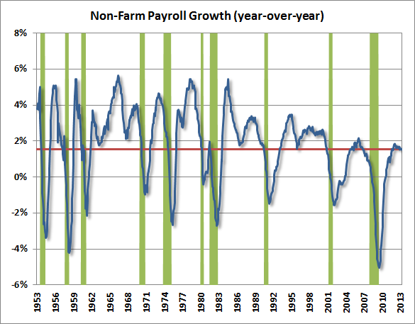
Source: Hussman Funds
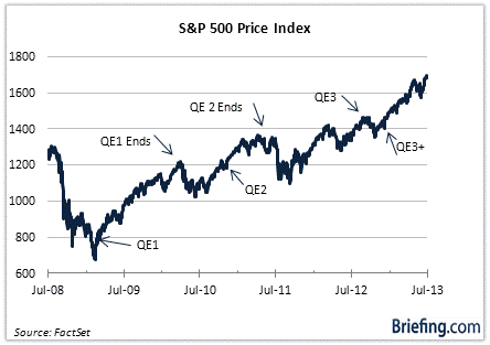
What Good QE
Although it is undeniable the economy has improved, since the last recession, strong economic growth is not what has driven strong stock market returns. But a strong correlation can be found between quantitative easing policies by the Federal Reserve and stock market rallies. However, a lack of correlation between quantitative easing and economic growth might make these the scariest charts of this series. If quantitative easing isn’t having much of a positive effect on the economy, but does have negative implications (and there are multiple reasons to believe so) and investors are buying stocks on a false premise, then people are in for a shock when the market adjusts downwards to that reality.


Source: Alhambra Investment Partners
SeekingAlpha “Caught Up in Notes of Caution”
2013 is a Scary Number
Since 2011 I have written of 2013 being a period when stock market risk would rise. The reason for my concerns are founded in politics. Prior to elections, politicians tend not to embark on ambitious endeavors that could upset the economy, instead pursuing policies to support short-term growth and facilitate smooth power transitions. However, after such transitions stock market turmoil sometimes unfold. In the United States the risk of a bear market is highest is the first two years of a president’s term. The below chart shows we are now into the riskiest period in the presidential cycle. But 2013 is scary not just for the U.S. presidential cycle. A transition to new leadership has also transpired in China, with new policies initiated to restructure that economy. A new government in Japan is now pursuing extreme monetary policy. German elections that just took place will have important impacts on Europe, particularly in relation to Euro area structural issues that remain unresolved. In short the potential for disruptive changes to the global economy is rising. Even if we get into 2014, without stocks receding, there is good reason to remain nervous.
All Star Charts“The Worst Time in the Presidential Cycle Starts Now”
Not a Pretty Picture
None of these charts, not even the presidential cycle chart depicting rising risk, forecast an imminent decline in stock prices. My intention in compiling these charts was not to make the case that the stock market is in a topping phase and poised for a fall. Such charts leveraging technical analysis are readily available, as are technical charts predicting the opposite–that this market is set to go even higher. Nor was it my intention to simply find the scariest, most bearish stock market-related charts I could. For example it would have been easy to compile several charts showing the market valuation at an extreme and poised for a fall, but charts are also available arguing the stock market is cheap. In my opinion current valuations are more a negative than positive, but it is extremely difficult to find reliable valuation forecasting tools. Although when Warren Buffett stops buying, because he can’t find good value it has never been a good sign. But I didn’t go out with a mission of just finding bearish charts. Instead what makes these charts scary in my opinion is that when a serious investor takes a look at long-term trends and patterns that matter, so many of them are worrisome. In my view this is a particularly dangerous time for investors. If such charts are road signs to the stock market then the message here is clear: Proceed with Caution.

Clear, balanced, intelligent analysis.
Thank you.