I.C. Angles Investment Post…
Unwilling to yet call a bear market, I have nevertheless become increasingly negative on this bull market. But despite a rough January, the stock market, as measured by the S&P 500, remains above its 125-day moving average—a level it has held for over a year. As such it would still be premature to call the current bull market over. But it’s not too early to examine why a meaningful move down with a breach of important technical levels, such as the 125-day, will be a reason to adopt a defensive posture, rather than “buy the dip” as so many are already advocating. In the spirit of my first “A Scary Looking Market” post I’ve included some new charts that argue against many of the currently popular bullish arguments. There is good reason to believe that optimism for the ability of the Federal Reserve through monetary policy to engineer strong economic growth is misplaced. Also unlikely to be realized is the hope that stock price multiples will grow further in a Great Rotation of investors moving from cash and bonds into stocks.
The Party is Still Over
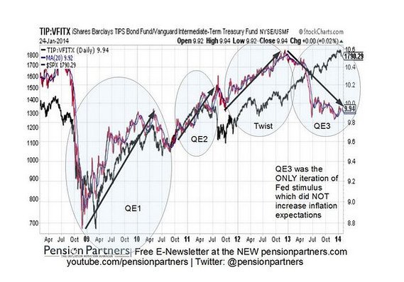
In June I wrote my “The Party is Over” post arguing extreme monetary policy was hitting its limits. Since then I have provided additional information showing monetary policy by the Federal Reserve is not producing the desired effects. Now some markets appear to be getting the message. The below chart, courtesy of Pension Partners, LLC., illustrates this contention in terms of inflation expectations. This chart compares the price ratio of the iShares Barclay TIPS Bond Fund ETF to the Vanguard Intermediate Term Treasury Fund overlaid against the S&P 500. A falling ratio equates to falling inflation expectations. This chart shows that quantitative easing is no longer driving rising inflation expectations in the bond market. In addition emerging markets have also been selling off. Nonetheless the U.S. stock market is signaling the opposite—that the economy will keep growing and driving inflation higher. Such market disconnects tend to get settled violently for better or worse with a dramatic convergence. My expectation is this will take the shape of U.S. stocks moving down.
Forget Strong Growth, Worry About Recession
This extremely weak economic recovery has been marked by economists again and again claiming stronger growth is right around the corner. This year has been no exception. But the following chart, courtesy of Angry Bear, illustrates that not only might strong growth not be around the corner, but it could instead be a recession that rears its ugly head. Showing the economy may be exhibiting the type of unsustainable growth indicative of a looming recession, it plots the aggregate profit rate versus the savings rate of capital income, with the vertical red lines indicating the start of past recessions. The aggregate profit rate has been high and flat for two years indicating it has reached its expansion limit. The savings rate of capital income has formed a v-shaped bottom at around the 59 percent rate of previous recessions since the 1980’s. In addition the divergence between the two is also at a level previously signaling recessions, indicating the economy has overextended itself and is poised for a recession.
No Great Rotation
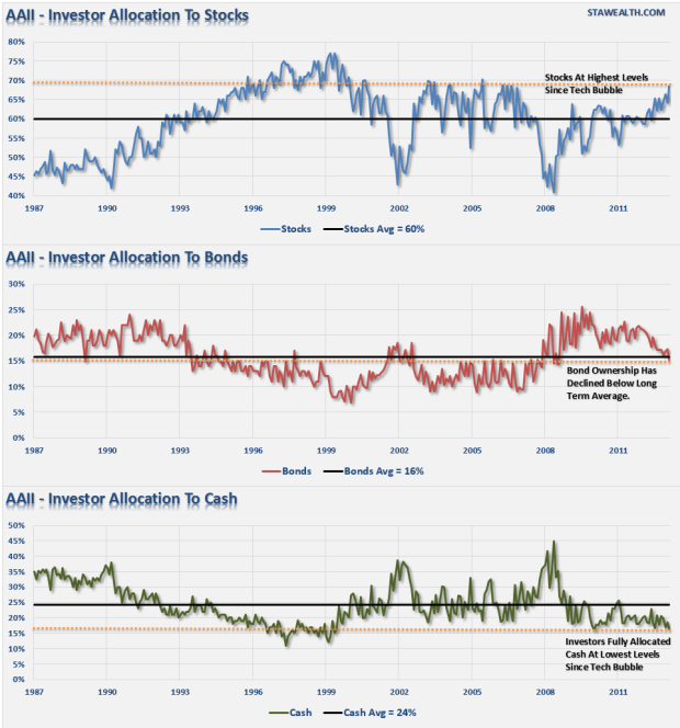
One of the more seductive arguments bulls are making is that we are in the midst of a Great Rotation, where investors will increasingly move money out of cash and bonds into the stocks, thereby driving the stock market higher. And one of the more powerful visual refutations of this argument I have found comes from “Investors Should Consider These Charts Before Getting Bullish on Stocks” authored by Lance Roberts. In addition the argument for a Great Rotation is also often made in concert with the assertion that stocks are cheap. As I’ve mentioned before different valuation methods show different conclusions on this topic, but the methods with the best predictive powers indicate stocks are expensive, with multiples having less room for expansion than widely believed. The article “Three Signs Stocks are Overpriced” is a good quick read on this topic. But regardless of valuation, the following charts show the argument that a Great Rotation will drive stocks higher and more expensive in a sustainable advance is unlikely to transpire, as investors have already largely rotated into stocks. In fact a reversal of such flows that would send stocks lower is an increasingly strong possibility.
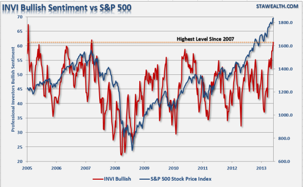
The next chart shows that professional investors are at levels of optimism when it comes to stocks last seen in 2007 just before the stock market entered the last bear market.
On a related note the following chart shows a pattern of declining optimism of the retail investors who have overweighted stocks similar also to what transpired before the last bear market. This further supports the contention that investors are already “all in” when it comes to stocks. A view further evidenced by the record stock market margin interest I pointed out in an earlier post.
Insiders are Selling
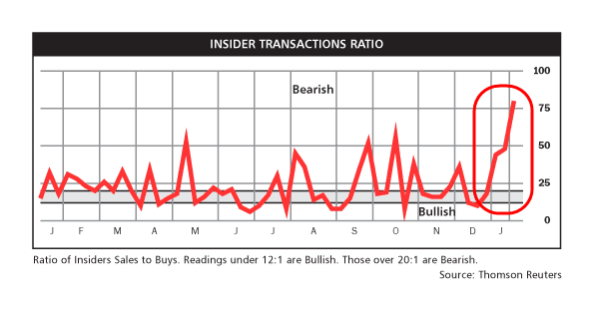
However, not all investors are buying stocks. Someone has to be selling their shares to the so-called retail “dumb money” who have moved from cash and bonds into stocks. And that is another reason to worry. Not only is some of that selling coming from institutions, but recently corporate insider selling has spiked. The next chart shows that insiders have stepped up their selling of company stock. While retail investors are called “dumb money” for typically buying and selling at the wrong times, corporate insiders often buy and sell at the right times. That’s not surprising. No one knows a company better than the people running it. So, while insiders continue to engage in financial engineering to push their stock prices higher by borrowing money cheaply to fund share buybacks, as well as lower cost loans, which reduce expenses, they are increasingly selling their personal shares. As such their recent uptick in selling is another bearish sign worth considering.
Not a Pretty Picture
These charts and others I have previously showcased do not paint a pretty picture of this stock market. But a chart I have yet to find is one that conclusively shows that an imminent decline of the stock market is upon us. I considered a market top last year a possibility, that the recent highs also may be a top, or alternatively that this market still may go higher before turning down, all very real possibilities. In truth I don’t have a strong conviction about exactly when this market will turn, only that when it does investors would be well advised to treat it as an oncoming locomotive and get out of the way, rather than buy the dips.


